vrijdag 8 april 2011

Reflection on our blog

In the beginning we were a little bit sceptic about the use of the blog, especially because we had to post three times a week. But it was a good motivation to document your findings. Normally at the end of a project you have to write almost everything. Now all the info (including motivations for decisions) is there and only small adjustments were needed. But if everything is already on the blog, why do we have to make a heading progress report on the blog as well? The blog already shows the entire process. The only difference is this last chapter. When all the groups started posting information the blog, it was interesting to see what all the groups were doing, what there inspiration was and whit what kind of concepts they created. But commenting on the two others blogs and receiving comments could have been better. One group we had to comment started blogging very late in the process, so we had nothing to comment on. And the other group made a new blog, so the first comments were gone. Posting three times a week on the blog is doable, but one or two times a week would be sufficient as well. It would have been nice if the staff had posted on the blog as well, for example the feedback of the first assignment. Using the blog for presentations is very useful. Normally it takes a lot of time to switch laptops or to put all the presentations on one PC.

dinsdag 5 april 2011

Our self running presentation!

So here we are, at the end of our project. Everything said and done is all put together in one self running presentation of our process throughout our project.

zondag 3 april 2011

Redesign

As a result of the user study we changed some details of the maps. The canals were mentioned a lot of time as being streets, so we made them less apparent, by changing the thickness and lightening the color. We also made the names along the canals blue to make it more clear those belong to the canals. To make the circle itself more striking we made it thicker.

Route P: Shopping route
Route K: Cultural Route

We also added "Oude kerk" between the Oude Delft and the Choorstraat. This did not resulted from the user study, but we did this to make the whole map more consistent.

With only two day until the final presentation we are working hard on our movie! The result will be posted after the presentation of next Tuesday.

xoxo Four Times O

vrijdag 1 april 2011

Results of the user study

All the results from last week's user study are analysed and visualized into three graphs, one column charts and two pie charts. The column chart shows the differences people saw when we showed them both maps; route K and route P.


Most people saw the differences in the size of the circles and the fonts and mentioned that there was something different in the darkness or opacity of the pictures. There was also a participant who saw a difference in the background of the maps, although both backgrounds were exactly the same. Two interviewees could not find differences between the two maps.

The two pie charts represent the results on the question which route people would walk when they visit Delft. The first pie chart is from the people who only saw route K and the second one from the people who saw route P.


For both routes the majority of the interviewees choose the direction we wanted them to choose, but there were also some people who choose the other one, especially from the people who saw route K. Striking is that there were a lot of people who wanted to walk across the canals, because they thought these were streets instead of the black circle. From this we can conclude that the canals are too prominent visible and for some people more striking than the black circle.

Despite the user study is conducted in The Hague there were some people who knew Delft a little bit. Those people reasoned from their previous experiences during choosing the route. Some of them even recognized the names mentioned on the canals and wanted to walk along these canals.
Another thing we discovered during the user study was the fact that the order of routes mentioned in the question influenced some of the participants. They thought they had to walk in the mentioned order. So, when we asked them: "You are going to visit Delft for shopping and visiting museums, which way would you walk?" They asked us: "So, I'm first going to shop and then visiting museums?" and the other way around if we first mentioned visiting museums and then shopping. We did not confirmed that this was the right or wrong order, to ensure we did not influence their choice.

With all these results of the user study we made a redesign of both maps. They will be placed on the blog as soon as possible, to show you our final design!

xoxo Four Times O

woensdag 30 maart 2011

Conducting User Study

Last week we conducted the user study to test our design of the maps. We interviewed twenty-two people at and around The Hague Central Station. We first showed them both versions simultaneously and asked the question: ‘Do you see any conspicuous differences between these two posters?’ After that we only showed one version op the map and asked which route they would choose if they were visiting Delft for shopping and visiting museums.

For the user study we use two prints of the maps which we stuck on foam board to make it easier to show the maps to the participants. We also made small questionnaires to record the date in a coherent way. Some of the interviews are filmed to show in our presentation movie.

We are now busy with analyzing the results of the user study and setting up a movie for the final presentation. On the basis of the results of the user study we will improve our maps.

Keep you posted!

xoxo Four Times O

dinsdag 22 maart 2011

Final -improved- concept!

Here are our improved maps!

Shopping Route

Cultural Route
xoxo Four Times O

Improvements assignment 2

Ok, so after the presentations of last week we needed to improve a few point before testing our concept.
We are not allowed to make indicate with use of the cirkel to direct people in the right way of walking. So we needed to adjust our cirkel thickness, remove the gradient in the cirkel and make the cirkel a smooth cirkel with no interruptions.


Old Cirkel


Improved Cirkel


To give people a little more direction we added some extra street-, square- and canalnames to the maps.


No Names

Added Names


And finally the depth of the canals in the right upper corner was not clear, these canals could use more depth.

No Depth
Added Depth
Our next update will be after our userstudy this thursday! And hopefully we will bring nice results!
Thanks for reading, feel free to let us know what you think!

xoxo Four Times O 

maandag 14 maart 2011

Final Concepts

The very first concepts we made were all very different with different approaches. During a creative session where we discussed all the concepts we decided to combine several of these different aspects into our final concept. So we used the sketchy style and the enclosing contour of concept 2, some of the pictures of concepts 2 and the style of the canals and text of concept 3.

Map K: Cultural Route

Map P: Shopping route

To indicate the route we made use of some of the theories from the book of Colin Ware ‘Visual Thinking for Design’. We implemented a basic pattern-defining mechanism to establish relationships between the graphical entities. We used an enclosing contour and a common color gradient region. By using a connecting contour people will recognize these visual patterns and relationships between the different components. (Chapter 3, p.58)

To indicate the highlight in the city center of Delft we used pictures of these places. The environment around these objects is left out and replaced by a very basic and clean visualization of the circle and the canals. This creates a feature-level contrast between the objects and the surrounding, what makes that the objects distinct and pop-out. (Chapter 2, p.29)

We have related our graphical objects, used to indicate different highlights in the center of Delft, by giving them the same texture, contour color and style. These objects are indicated by a circle. The size of these circles shows which objects are most important. In our case the two different circles, clockwise the ‘Cultural route’ and anticlockwise the ‘shopping route’, do have an order in circles by different sizes. People will perceive the large circles as more important unlike the small pictures. Therefore it is more likely they will start the route at the object with the biggest circle. (Chapter 3, p. 63, 64)


Our concepts.


Last week we designed 3 concepts. With all a completely different approach. 
Here you can view them all:


Inspired by the Delft Blue tiles this concept emphasizes the depth of the circle by using a oval shape. The buildings close by, are larger than the buildings further way.
The icons used are based on photographs of the actual buildings. 


With the use of images the tourist will be able to recognize the buildings which he will pas when walking the route. The images where the tourist should start are shown completely and the images which he will see at the end of his tour are shown partly. 


This concept uses no pictures but only icons of recognizable figures along the route. Inspired by the London-Tube Map. The tourist will know how to walk the route because of certain streets or canals he crosses over or passes by. 

zondag 13 maart 2011

More maps

The further away you get from the entrance, the smaller the objects become.


A classic version of maps with small icons.
It still works, this could be interesting to see why this (still) works so well and is used to often.

Black and white, with a touch of color to indicate the place to be.

Bright colors close by and grey tone colors that indicate the houses are further away.

maandag 7 maart 2011

Inspiration for assignment 2!

Looking at our restrictions for this assignment there is one famous example which arose straight to our fabulous minds: The London Subway map!!


Also known as "The Tube"
Originally redesigned by Harry Beck in 1933!


If you want to know more about the design of the map and the development throughout the years of time, check out this website: History of the Tube to learn more!!

xoxo Four Times O!

Assignment 2

During our famous monday lunch meeting we discussed the next assignment. For the city of Delft we need to design one route that visitors of the city will follow for either a cultural snack or shopping spree. 
So visitors will get an intake of culture and be able to shop walking this one route. 
The restrictions to the design of the map is a real challenge.


Several things are not allowed in the design:
• The use of text on the billboard is not allowed, with the exception of names of buildings, museums, streets and squares.
• The design of the circle and the startingpoint should be 100% the same on both versions.
• The use of arrows or other arrowlike symbols as indicator for direction is not allowed.
• The names 'Cultural route' and 'shopping route' should not be used on the map. You can refer to these routes by route K and route P.
• There will not be a key to symbols. All visual elements should speak for themselves.

A real challenge, but very exiting and we can't wait to get started!
Hope to update ya'll soon with our first concepts!


xoxo Four Times O

dinsdag 1 maart 2011

Assignment 1

Grapus Poster 2
-Grapus

Grapus poster 2, was made by a group of artists named Grapus. They were founded by Bernand in 1970. Grapus wanted to change life by graphical work andpolitical actions. They expressed their concerns by placing their self-made posters on the street. 1
Figure 1. Grapus poster 2


Chapter 3 – Structuring Two-Dimensional Space
In this poster, figure 1 the viewer will receive the most information in the sideways directions. All details are in the middle of the poster in the vertical plane. From the three dimension, two, including the sideways direction are special. They are perceived differently from each other and from other orientations. [44,47]
People are very sensitive to whether something is exactly vertical or horizontal. We immediately see that black objects (weaponry) form a vertical straight line and that the colored boxes are not parallel to that line, see figure 4.[57]
Figure 3. The weaponry Figure 4. Vertical and parallel


Objects can be separated from its background in many different ways; luminance changes at its silhouette, color differences, texture boundaries and even motion boundaries. In this case the weaponry, figure 3 is distinguished from the environment because their continuous contour is running all around the objects and they differ in color with the background. In the pattern-processing stage of perception the brain requires a generalized contour extraction mechanism. [45, 49] But pattern perceptions is more than contours. Groups of objects like, this weaponry, can form patterns based on the proximity of the elements; spatial layout.
Figures 5 shows two patterns, they both will excite the same large-scale feature detector giving the same overall shape. Because these patterns are large-scale structures, the large-scale oriented feature detectors will be stimulated by them. [56]
The objects/ the weaponry are shaped differently, which means that they are actually patterns of a pattern. This stimulates both small-scale features and medium-scale features. [57] The objects in proximity are similar concepts and have related information. They are all different weapons in the same color. The objects are not connected to each other by any graphical form, but because people recognize the objects as planes, boats, tanks etc. and they are pointing in the same direction, the objects have a common relationship; attacking the world. [63]


Figure 5: Spatial layout

Chapter 4 - Color
In the middle are two images in color, the background and the objects mentioned in the previous chapter are in black and white. The colors of the earth are not very saturated and close to a gray scale. So the colored boxes attract the attention more effectively. But a color is even more effective as a highlighter when there is only a single color used, other than black and white. [81] So a pop-out effect depends both on the other colored objects in the scene and on the background color. [77]


Black, white, red, green, yellow and blue are the colors most commonly used in the world. And according to the opponent-process theory these colors are special. All of them accept green are used in this poster.[70]

Figure 6. The colored boxes


The meanings of colors are culturally determined, and therefore colors may have different meanings in other countries. In the western world red represents danger, heat and stop. This is the reason why the text explaining the main goal of the poster is placed in the red box (figure 6). And this also explains why green is not used; green represents go, safety and renewal. [84]
Using colors for indicating categories of information is very important. Each colored box contains a part of information.[77]

Showing small yellow text on a black background is
very easy to read. There is sufficient luminance contrast. [68] When using large fonts, the luminance contrast with the background becomes less important. [76] Paris22, 1983 is readable, even though a low saturated color for the font is used on bright color. But ‘octobre’ is written in a smaller font, and therefore harder to read (Figure 6).

Chapter 7 – Visual and Verbal Narrative
In most cases images do not make good labels, and describing complex patterns of relationships with words is confusing. Here a combination is made. The reason for the protest is expressed with images;weaponryattacking the world and the protest information is expressed in words. [134]
We humans can only fixate on one point at the time because we only have one fovea. The two images in the middle are the only ones in color and attract the viewer’s attention immediately. Here the most important information is shown.
When people have a more closer look and switch their attention to the background, they see that partly the same information is shown as in the colored boxes; the location, Paris. [140]
Cartoons often use actions lines, these graphical strokes show movement pathways. All different weaponryare placed in such a way, that they look like an arrow. This is not exactly an action line, but we understand that they are approaching the earth. [142]


Innocent Advertisement
-Innocent

Innocent was founded by three Cambridge graduates, Richard Reed, Adam Balon and Jon Wright. They guarantee the use of 100% pure and fresh fruit in all of their smoothies. Nothing else. No added sugar. No water. No Concentrates. Each innocent smoothie contains over three-quarters of a pound of fruit, the recommended daily intake in fact.2
Figure 7: Innocent advertisement
Chapter 1 – Visual Queries
The act of perception is determined by two kinds of processes. From the picture shown on the right you will first perceive some visual information, like a little bottle in a meadow. Secondly you reinforce relevant information by the demands of attention. You are trying to solve some kind of cognitive problem.
In case of figure 7 it may be to determine the message of this advertisement; for example, what do they want to tell me? The answer of this question can be obtained by a series of searches for particular patterns, visual queries [3]. You will find yourself making a series of eye movements focusing your visual attention on the little bottle and then the fruit pile. You will notice the background but as you perform the task it will recede from you awareness. Even the bottle recedes from your awareness if you focusing on the text on the bottle, by the visual query what is the name of the band? It makes it possible that you can create patterns about the picture and solve the problems. Perceiving the fruit pile and the bottle may give you the answer that the fruit pile stands for the fruit in the bottle. This is called the top-down effect.
Observing figure 7 is a skilled active process. Your eyes move across the picture seeking out what you need. The critical information falls on the high-resolution fovea. Each time the eyes briefly come to rest the pattern-processing starts and search for the most relevant information to you current cognitive task. According to the picture your intermediate pattern processors detect and pass the information about the color red, that is imaged on a particular part of the retina, a moment later this red color is come labeled as strawberry. The same with the grass, the retina sees some figure; little green features became patterns what leads to the objectgrass (figure 8) This is called the bottom–up effect.


Figure 8: The bottum-up effect

When you see the bottle, you do not simply from an image of that bottle in your head. Instead the few features that you have directly fixated are bound together with the knowledge you have about bottles in general and this bottle.
Thus, what you see depends on both the information in the pattern on the page as it is processed bottom-up through the various neural processing stages, and on the top-down effects of attention that determines both where you look and what you pull out from the patterns on the page [9].


Chapter 2 – What we can easily see
The white label almost certainly popped out at you the moment you look to the advertisement. It is not surrounded with other related colors. The label distinct itself so it becomes the centre of fixation by eye movements. This fixation is strengthened by the sky, forest and meadow, because of their blurriness, the label is a sharp white color.
From the label the eye will make a movement to the orange child drawing head with the halo. It is a non-filled drawing, a feature what distinct the drawing from the filled surrounding. But also the orange color and the curvature make the drawing pop out.
The label does have a square orientation, as well as the text underneath the head, instead of the round head and halo. Thereafter, the fruit pile becomes visible, because of the size and triangular orientation. If the eyes are fixed on the fruit pile the strawberries will pop out. The red color is more different from the surrounding then for example the light green color of the grapes. The light green color is almost equal of the banana and lemon. This makes it difficult to discriminate the different kinds of fruit. However, the red strawberries in the fruit pile can be found with a single fixation because there is only one red colored object in the fruit pile. Last, the forest and then the sky become visible. The dark color from the forest will force you to look at first instead of the light color of the sky. When your eyes move across the sky you will perceive the number 169 what leads to an eye fixation at the end. See figure 9.
The whole picture does have a horizontal orientation, see figure 10. Even the line between the bottle and the fruit pile is a straight horizontal line. Only the fruit pile and the bottle, they are more vertical orientated. This horizontal orientation makes the bottle and fruit pile more outstanding. The spatial grouping in this advertisement is also a reason the fruit pile and bottle pops-out. Because of the group of fruit and the stand alone bottle, your eyes will see the little bottle the first the moment you see this advertisement. The little bottle is the outsider and falls on.

Figure 9. Main focus points of the human eye Figure 10. Orientation of the objects

Chapter 3 – Structuring two-dimensional Space
The brain contains mechanisms that rapidly define regions having common texture. Excluding color and overall lightness, the primary factors that make one texture distinct from another are gain size, orientation, and contrast.
Figure 11 shows different textures. The messy vertical orientation of the grass makes it easy to discriminate the bottle and the fruit pile. The bottle does have a smooth texture like the grapes on the fruit pile. The strawberries distinguish themselves by a more rugged texture from the grapes.


Figure 11. Textures

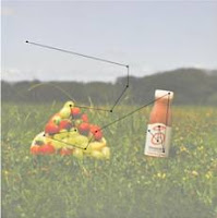
At the top and the bottom of this picture the blur distinct the middle of the picture. The dark forest stroke discriminate the white bottle cap and the sky. The different fruit is also recognizable though contrast.
In this advertisement all details are in the middle of the poster. You will receive the most information about the whole advertisement in the sideway direction. The eyes are constantly make movements from the Innocent bottle to the fruit pile and back. However, if you look more detailed, at the innocent bottle itself, the sideway direction still gain you the most information. For instance, you want to read the text on the bottle, your eyes will make a movement from the left to the right.
Only the size of the bottle will demand an up-down movement.
As we are very sensitive to whether something is exactly vertical or horizontal, the innocent bottle strikes you immediately. It is only rotated a few degrees from the vertical, see figure 12, yet this little difference is clearly visible.
Figure 12: Vertical or not?


Madonna of the Harpies
-Andrea del Sarto’s (1517)


Madonna of the Harpies (Madonna delle Arpie) is a painting made by Andrea delSarto’s in 1517. In 1984 the layers of dirt and overpainting are removed and the rich colors of the work became visible.


Figure 13. Madonna della Arpie by Andrea del Sarto


Chapter 2 – What we can easily see
What directly pops out when you look at the picture is the polygonal pedestal, centrally located on the lower part of the painting. The pedestal is the most shining object between several objects with a more flat character. The colors are light and the object contains some highlights. The human eye is triggered by the high degree of feature-level contrast between the pedestal and the surrounding and a single eye fixation is enough to notice the pedestal. [28] This effect is strengthened by the step under the pedestal, because of the light color and the orientation of the step. Almost all objects in this painting are oriented in a vertical position, even the line in the background of the painting. Conversely, the step is place in a more horizontal orientation. Also on the top and the bottom of the pedestal you can see horizontal orientation. This is horizontally oriented makes the step, and at the same time the pedestal placed on this step, even more conspicuous. [33]
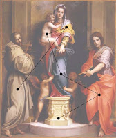
Figure 14: Orientation of the objects Figure 15: Main focus points of the human eye

From the pedestal the eye will make a movement to the right, where the clear red robe of the lady standing next to Madonna draws the attention. From the robe the eye will move straight up, along the clear blue colored mantle of Madonna, to Madonna’s upper part of the body and the child in her arms. The bright colored yellow fabric on the shoulder of Madonna and the light colored cloth on her head catch the eye. Also the child is light colored and the arm and leg of the child contain a subtle highlight, which makes the child stand out from the dark background.
After Madonna the person on the left will become visible. His dress is sober in color and his head almost disappear against the background. It takes a longer time to see all the details, like the books the two ladies have in their hand and the cross in the hands of the man. These objects have almost the same color as the background and are small in proportion to the bigger colored surfaces, like the robes, fabrics, the pedestal and the child. [35]


Chapter 5 – Getting the information: Visal space and time
Andrea made use of the most powerful pictorial depth cue called occlusion; objects that visually block other objects appear closer. Some examples of these occlusions are: the feet of the man on the left are painted in front of the step. This tells us that the man is standing in front of the step. Next to that you can see that the pedestal covers a part of the two angels standing on the left and the right of it. From this we can conclude that the two angels stand behind the pedestal. The hand and the arm of the angel on the right cover a part blue mantle of Madonna. Because of this we know that the angel is holding the leg of Madonna.
The amount of occlusion is reduced to a minimum, which also reduces the amount of depth in the painting. Almost all the persons on the painting stand next to each other and behind them there is only a wall. The minimum of occlusion does ensure that no information is lost. Andrea even made use of transparency to show more or less the whole wing of the left angel, which is actually behind the dress of the man totally on the left. [91]
Figure 16: Foot with the cast shadow and right without 
Figure 17: Left an enlargement of the wing behind the transparent robe

Another pictorial depth cue used is the cast shadow. This shadow provides information about the distance between different objects. For example the foot of the man on the left is lifted up from the ground. The cast shadow on the ground helps us to understand the position of the foot and makes it much more realistic. [92, 95] The size and position of the cast shadow of Madonna and the child on the wall shows that they are standing close by the wall, but not against it.
Not only cast shadow helps to understand the position of the objects on the painting, but also shading plays a big role. By using shading the creases in the fabric appear, which shows the way the clothes cover the bodies of the people. The shading is also used on the naked body of the child in the arms of Madonna. These shadings help to make the difference between the limbs of the child and explain his position. Next to the shadings the highlights play a big role in showing the limbs and explaining the child’s position. [92]
The highlights are used on the pedestal too. Here the highlights are not only used to show the different elements of the object, but also to let the pedestal shine. The highlights help here to show the polished texture of the pedestal and that goes for the step under the pedestal to. Andrea used some more highlights on the bodies of the angels and on arms, hands, toes and faces of the people.
Not only small elements of the painting make it come more alive and perceived as 3D, but also the used perspective contributes to this. It looks like Andrea made use of a linear perspective, but during the reconstruction of the vanishing point, all the lines look randomly chosen. That is why it seems more likely that Andrea made use of an oblique projection; he painted the frontal view of the objects and added the sides to it in a way it seems to look realistic. [92]
Figure 18: An attempt to reconstruction of the vanishing points

Chapter 7 – Visual and verbal narrative
The painting of Madonna of the Harpies does not contain much text or textual symbols. The only text is the Latin text on the pedestal. This text is “Ad summu regna tronu defertur in altum” which is translated by art experts into “The queen is transported to the supreme throne high above”. Under this text the date is written in Latin MDXVII (1517) and above this text Andrea del Sarto placed his own signature.3 [130]
The objects on the painting could also tell a whole story. Beside the text there are also some figures on the pedestal. They faces look scared and despaired and they seem to look up to Madonna. Their bodies do not look totally human, because of the very long legs and feet and the wings on their backs. [135]
The main focuses of the painting are the objects in front of it. The background is very clean and sober, to ensure the attention of the viewer will not lead away from the narrative thread. In the middle a woman is standing central and somewhat higher than the other figures on the painting. This let us assume that this woman is Madonna. Because she is the one who is standing on the pedestal with the text it looks like this text applies to her, so she could be the queen and the pedestal could be the throne. The man and the woman next to the pedestal, respectively on the left and the right, are standing on the ground and more to the side of the painting. This makes them look less important. [139] The three characters seem to look to something in front of them which is a little bit lower, because their looks are directed towards the ground. The beaten down eyes of Madonna makes her look a little bit sad. The two people on the side seem to protect the cross and the content of the book.
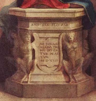
Figure 19: Pedestal with Latin text

Their bodies are turned towards Madonna, while they look towards the viewer of the painting. The position and facial expression of the angel on the left, holding the leg of Madonna, looks desperate. He wants to stay with Madonna or maybe he wants to be lifted up like the child on Madonna’s arm. [137]
There are also a lot of symbolic objects in the painting, like the cross held by the man on the left, the almost invisible aureoles above the heads of the people, the books in the hands of Madonna and the woman right from her and the child with the angel wings. All these symbols point at a religious representation. Striking is that all these objects are painted very dark and inconspicuous.
The whole representation is very static. The position of the people is very static, especially Madonna standing on the pedestal, which could be associated with a statue. Andrea did not made use of features to encourage the intention of movement, but maybe he even didn’t want to give the viewer the intention of movement. [142]


Fishing boats on the Beach at 
Les Saintes-Maries-de-la-Mer
-Vincent van Gogh (1888)

Vincent van Gogh completed Fishing boats on the Beach at Les Saintes
Maries de la Mer (figure 19) in 1888, after spending time sketching on the shore of the Mediterranean fishing village.
It has a nearly even division of beach and sky. The boats are positioned in such a way that they break through this division created by beach and sky and unite them together. All used colors are controlled and individual objects are bound by black lines. 4


Chapter 1 –Visual Queries
We apprehend only a tiny amount of the information in our surroundings, but it is usually just the right information to carry us through the task of the moment. [1]
Visual thinking consists of a series of acts of attention, driving eye movement and tuning our patter-finding circuits. These acts of attention are called visual queries. [3]
The act of perception is determined by two kinds of processes: bottom-up and top-down. Driven by respectively the visual information in the pattern of light falling on the retina and driven by the demands of attention which in turn are determined by the needs of the tasks. [8]
Looking at figure 19 the queries could be:
- What is this painting about?
- What do these boats mean?
- Why are these boats on shore and the others at sea?
- Why did the painter paint these, other than because the look pretty.
Van Gogh was a true Impressionist, which means that he used an impression to paint. He wanted you to have the feeling of an impression. A glimpse. You don’t need to look at the painting for long to know what it’s about. Rough paint strokes indicate boats on the beach and boats at sea. Or wait, unique colorful boats without a sail are on the beach and the boats at sea have their sails out, but there unique colors blend in with the background and look the same, yellow and blue.
After having a better look you see the symmetry in the painting. Four boats on the beach, four at sea. The sky and land-sea division is also equal. The once impressionistically painting doesn’t seem to be that random anymore. Van Gogh carefully placed these boats on the canvas.
To find an answer to this query your eyes will search the painting via a series of eye-movements. But how do we decide where to move our eyes in a visual search task? How do we know where to look? And if we already know what is there, why do we need to look? [14]
A useful way of describing the way the brain operates to solve problems is as a set of nested loops. Outer loops with generalities. Inner loops process the details. [17]
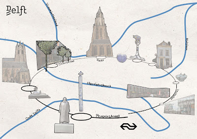
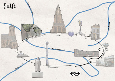
Chapter 4-Color


Figure 20. Fishing boats Figure 21. Black and white fishing boats
Van Gogh always used colors in his paintings. Perceiving colors is a biological thing and mostly depending on light. There are two basic types of light receptors in the retina at the back of the eyeball: rods and cones. The rods are used for low-light levels (which we hardly need in our artificially lit world) and the cones are the basis for normal daytime vision. They come in three subtypes; short-, middle- and long-wavelength sensitive. These three different types of cones mean color vision is fundamentally 3D. [66]
Most of the important principles for effectively using color in design can be derived from understanding of the red-green, yellow-blue and black-white color channels. [69]
In the painting (figure 20) we can clearly see the difference between sea and ocean and even more clear see the difference between beach and sea. But when taking away the colors the only thing very clear are the four boats on the beach (figure 21). The separation between sea and beach is hardly to see, maybe by viewing the colored version first, you understand that the light grey parts in the right of the painting is the white foam of the sea when coming to shore. The contrast we had in de colored version almost evaporates in the black and white version.
The more vivid a color, the more saturated it is said to be. More saturated colors are those that have strong signals on one or both of the chromatic channels. [71] The colors for the background (sky, sea and beach) are not very vivid and therefore have a low saturation. The subject of the painting, the fishing boats however have vivid colors and therefore also a high saturation. Van Gogh obviously wanted to focus all the attention to the boats and specifically the four boats on shore.


Chapter 5-Getting the Information: Visual Space and Time
We live in a 3D world. But the painting is only 2D although it is a representation of the 3D world.
In order to understand space and therefore 3D we make use of several depth cues. Depth cues can be divided into those that are pictorial and those that are non-pictorial. Pictorial depth cues can be reproduced in a photograph or in our case a realistic painting.
The most powerful depth cue is occlusion; objects that visually block other objects appear closer. [90]
Van Gogh easily made use of this depth cue by placing the boats on shore in front of each other. Also the sand that is in front of the bottom of the boat indicates that the boats are in/on the sand and therefore not floating around above the sand or in the sky.
Perspective size gradients is also a commonly used depth cue. As you can see in figure 22 the depth is created by making every boat after the one in front smaller. The four boats on the beach are the same model boat (only different colors), the boats at sea also have the same main characteristics as the boats on shore. The boats on shore are close enough to be examined and therefore the conclusion can be drawn that the all the boats are the same model (and size). So by picturing the same model boat first on the beach and later also at sea we can assume that the smaller the boat is, the further away.
If the boats on the beach were all different models the observer would never be sure to assume that the smaller the boat the further away it is. For instance, it could also be a small toy boat.
Van Gogh used cast shadows to indicate where the boats are positioned in the space. The cast shadows tie them to the ground and therefore give the observer a fair shot at estimating the distance. The cast shadow can be found, although very slightly under the boats with a darker patch of sand (figure 23).
Depth of focus: The human eye, like a camera lens, focuses objects at a specific distance. Objects that are farther away or nearer are blurred. [93] In the painting of Van Gogh he made use of this depth cues by blurring the boats at sea. The smaller the boat gets, the more blurred it becomes. Of course this is also because of his painting technique (the impressionic strokes) but also to emphasize the depth of the painting. You can’t see the boat clear, just like in real life because it is too far away, only now Van Gogh blurred it for you.
Degree of contrast is the obvious depth cue Van Gogh made use of. Because neither air nor water is completely transparent, the contrast between an object and its background is reduced as distance increases. [93] Comparing the contrast of the boats in figure 24 and the boats in figure 25, you could easily say which one is closer without ever seeing the painting of Van Gogh before.

Figure 22. Perspective size gradients Figure 23. Cast shadows


Figure 24. Close up from painting, blurry boats in the distance Figure 25. Close up from painting, closest boat

2http://en.wikipedia.org/wiki/Innocent_Drinks (26-02-2011)
3 http://www.scribd.com/doc/33498536/Simona-Cohen-2008-Animals-as-Disguised-Symbols-in-Renaissance-Art-Brill%E2%80%99s-Studies-in-Intellectual-History-Vol-II (21-02-2011)
4http://www.paintingmania.com/fishing-boats-beach-les-saintes-maries-de-la-mer-6_2866.html (25-02-2011)