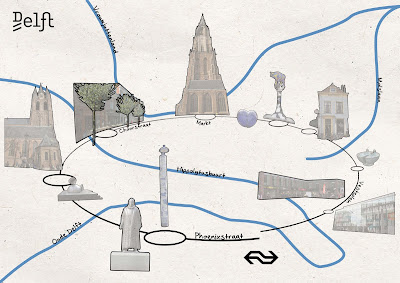
The very first concepts we made were all very different with different approaches. During a creative session where we discussed all the concepts we decided to combine several of these different aspects into our final concept. So we used the sketchy style and the enclosing contour of concept 2, some of the pictures of concepts 2 and the style of the canals and text of concept 3.
Map K: Cultural Route
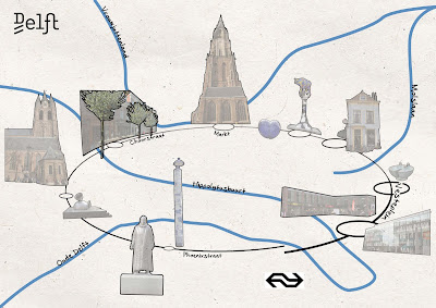
Map P: Shopping route
To indicate the route we made use of some of the theories from the book of Colin Ware ‘Visual Thinking for Design’. We implemented a basic pattern-defining mechanism to establish relationships between the graphical entities. We used an enclosing contour and a common color gradient region. By using a connecting contour people will recognize these visual patterns and relationships between the different components. (Chapter 3, p.58)
To indicate the highlight in the city center of Delft we used pictures of these places. The environment around these objects is left out and replaced by a very basic and clean visualization of the circle and the canals. This creates a feature-level contrast between the objects and the surrounding, what makes that the objects distinct and pop-out. (Chapter 2, p.29)
We have related our graphical objects, used to indicate different highlights in the center of Delft, by giving them the same texture, contour color and style. These objects are indicated by a circle. The size of these circles shows which objects are most important. In our case the two different circles, clockwise the ‘Cultural route’ and anticlockwise the ‘shopping route’, do have an order in circles by different sizes. People will perceive the large circles as more important unlike the small pictures. Therefore it is more likely they will start the route at the object with the biggest circle. (Chapter 3, p. 63, 64)